
Upgrade to transmitter coverage maps - now showing potential interference areas

 Brian Butterworth published on UK Free TV
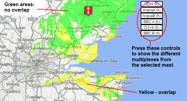
 Now, on the maps the bright green areas shown where the signal from this transmitter is strong, dark green areas are poorer signals. Those parts shown in yellow may have interference on the same frequency from other masts.
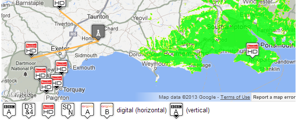
The next change is that the frequency usage maps (such as C21 (474.0MHz) after switchover) show the polarity (the position the receiver aerial has to be in) by the use of a black triangle to show "vertical".
The transmitter pages now show overlaps - for example Sudbury (Suffolk, England) full-Freeview transmitter shows a large overlap area to the south.
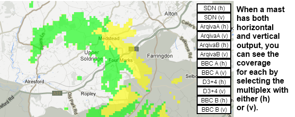
On transmitter site that broadcast in both horizontal and vertical, you can now see the difference that the selection of position makes (for example at Rowridge (Isle Of Wight, England) full-Freeview transmitter ):
Grfaham Tuggey: Because your TV is not tuned to Waltham.
| link to this comment |

7:36 AM
cant up date my box and tell me why
| link to this comment |
barry's: mapB's Freeview map terrainB's terrain plot wavesB's frequency data B's Freeview Detailed Coverage
12:03 PM
barry swain : Hi, Barry. I'm afraid we can't tell you the reason for your not being able to update your box unless you can tell us the make and model of your box and preferably the date you purchased it - the nearest year would probably do for that. Reply back with this information and then one of us should be able to help you. Richard, Norwich.
| link to this comment |
3:15 PM
please can you tell me why i cant receive freeview around lunch time each day. i get a message saying i may be having a weak signal or no signal. this has been happening since Xmas. i live in Milton in the Cambridge area. i have retuned my free view more than once. i get a good signal later in the afternoon and evening.
| link to this comment |
4:35 PM
b.fuller: If it's happening at the same time every day, it's most likely being cause by local electronic interference from something operating on a timer switch (probably something with an electric motor such as a central heating pump or electrical appliance). Retuning will never fix a problem like this as your TV is already correctly tuned.
| link to this comment |